Stardew Valley Companion
Overview
A UX-focused companion app designed to reduce early-game overwhelm for first-time Stardew Valley players through structured scheduling, NPC tracking, and lightweight onboarding.
User Researcher
UI/UX Designer
Competitive Analysis
User Interviews
Figma
June 2025 – December 2025
View interactive Figma prototype →
My Role
This was a self-initiated, solo UX project. I owned the full design process—from research and problem definition to wireframing, interaction design, and high-fidelity prototyping. The project was approached with production constraints in mind, as if it were shipping alongside a live game.
Design Constraints: Short in-game day cycles, spoiler sensitivity, and maintaining Stardew Valley's cozy tone.
Research Findings
I conducted informal user interviews and secondary research across Reddit, Steam Reviews, and fan forums, targeting beginner pain points.
78% frequently reported feeling rush due to lack of structure.
38% had a proper routine during the first in game year.
84% felt overwhelmed by the number of actions and consequences each day.
Key takeaway: Players found essential knowledge hidden and relied heavily on external resources, breaking immersion.
Insights
A recurring theme across discussions was frustration with how much essential knowledge felt hidden or reliant on external resources. Some players expressed that needing to constantly search for information online disrupted the immersive experience and detracted from the game's cozy atmosphere. They felt that a well-designed game should provide that clarity intuitively, without needing to consult a wiki just to understand how to play.
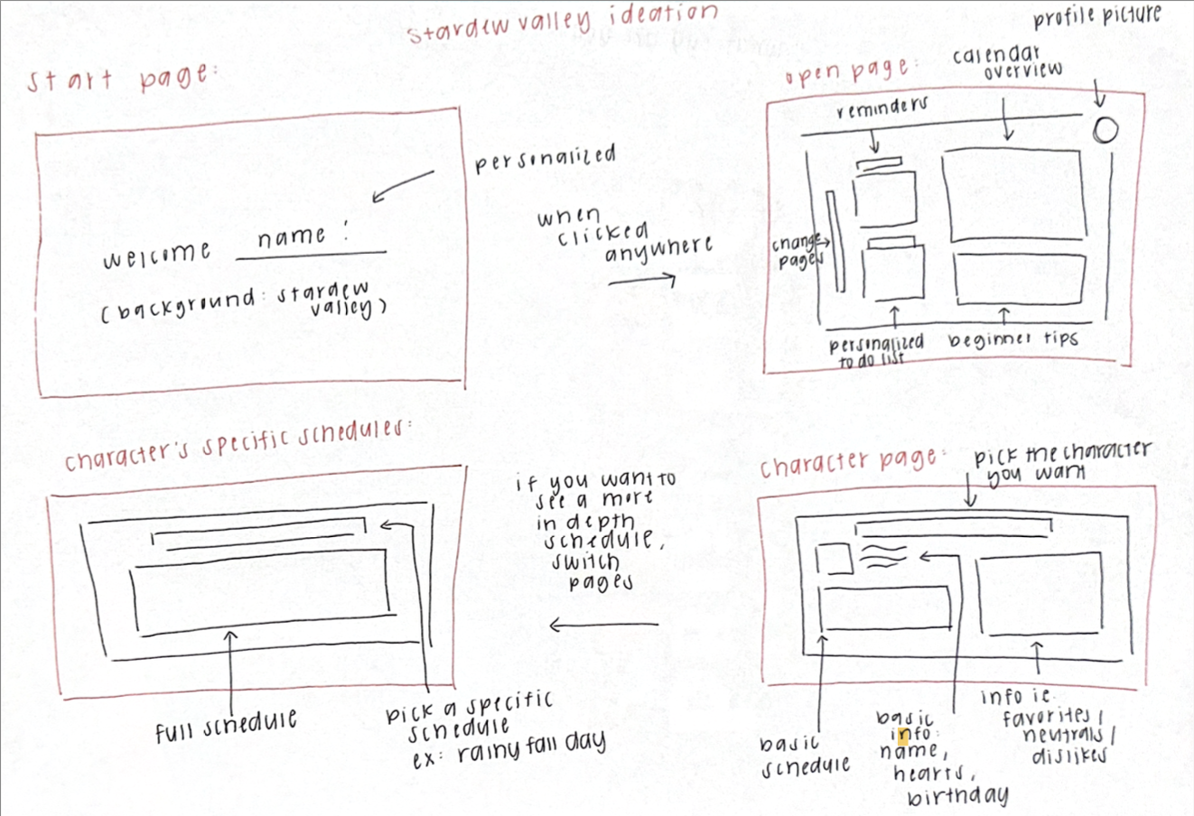
Design Decisions
Early designs were too feature-dense. I iterated toward clearer hierarchy, progressive disclosure, and fewer simultaneous decisions per screen. Daily goals were separated from long-term progression to mirror Stardew's short-session loop, reducing time pressure while preserving player agency.
Solution
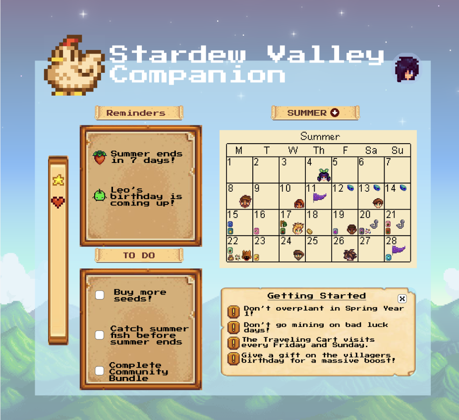
The app addresses information overload, time pressure, and hidden system knowledge through scaffolding that reduces cognitive load without removing player agency. NPC tracking uses progressive disclosure so players access detailed schedules only when needed.
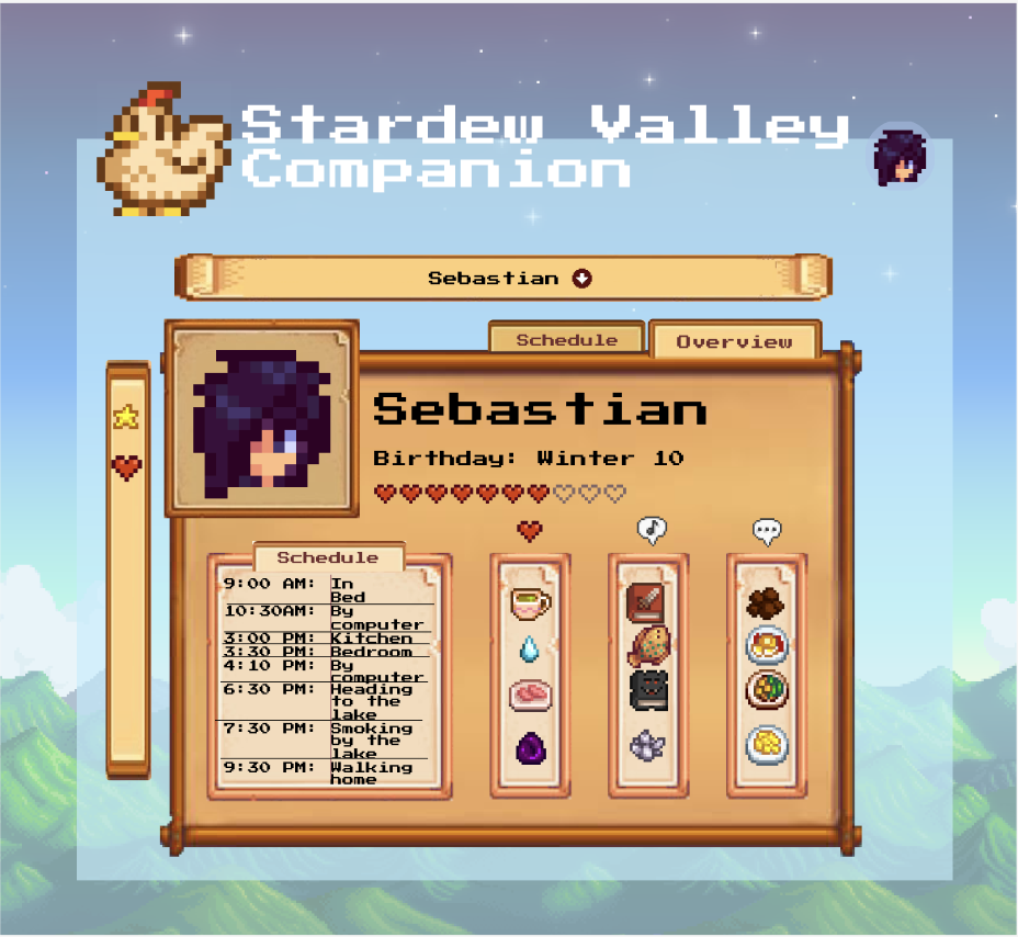
UX Rationale: NPC tracking was designed around progressive disclosure, allowing players to access detailed schedules only when needed, preserving discovery while reducing reliance on external wikis.
Next Steps
Usability testing with first-year players, dynamic seasonal recommendations, accessibility options, and spoiler-safe settings.
Conclusion
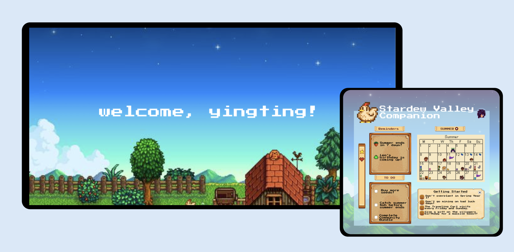
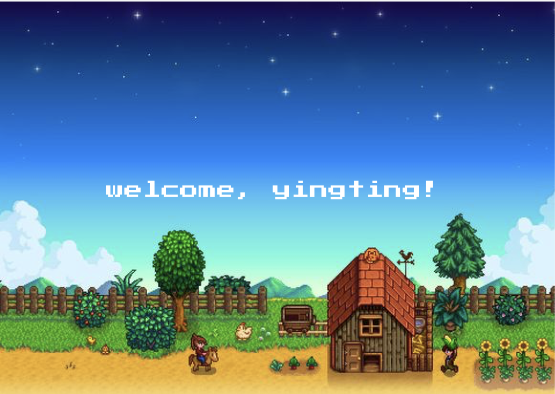
The pixelated art of Stardew Valley draws players in with its relaxing, cozy aesthetic. As a game designer, I recognize that this visual style not only supports the genre’s appeal but also enhances the immersive, long-term engagement encouraged by the game’s rich content. However, user research revealed that Stardew Valley presents a steep learning curve for newcomers. These insights informed my design of a companion app that helps players navigate the early game with more confidence. By offering lightweight, in-game, contextual guidance, like personal scheduling tools and NPC trackers. The app aims to ease pressure, reduce confusion, and let players enjoy the relaxed, exploratory nature of Stardew Valley on their own terms.
thank you for reading this case study!